2. Describing Data with Tables and Graphs
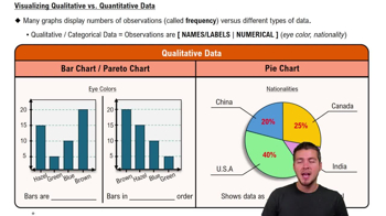
Visualizing Qualitative vs. Quantitative Data
Learn with other creators
Practice this topic
- Multiple Choice
Use the frequency distribution below to find the class width and class midpoints.
142views - Multiple Choice
The following data set shows the number of overtime hours that 12 employees worked in a month. Construct a frequency distribution, suing a lower class limit of 3 and a class width of 4.
74views - Textbook Question
Ethics There are data showing that smoking is detrimental to good health. Given that people could be helped and lives could be saved by reducing smoking, is it ethical to graph the data in a way that is misleading by exaggerating the health risks of smoking?
26views - Textbook Question
Finding the Best Model
In Exercises 5–16, construct a scatterplot and identify the mathematical model that best fits the given data. Assume that the model is to be used only for the scope of the given data, and consider only linear, quadratic, logarithmic, exponential, and power models.
Dirt Cheap The Cherry Hill Construction company in Branford, CT sells screened topsoil by the “yard,” which is actually a cubic yard. Let the variable x be the length (yd) of each side of a cube of screened topsoil. The table below lists the values of x along with the corresponding cost (dollars).
33views - Textbook Question
Finding the Best Model
In Exercises 5–16, construct a scatterplot and identify the mathematical model that best fits the given data. Assume that the model is to be used only for the scope of the given data, and consider only linear, quadratic, logarithmic, exponential, and power models.
Sound Intensity The table lists intensities of sounds as multiples of a basic reference sound. A scale similar to the decibel scale is used to measure the sound intensity.
29views - Textbook Question
In Exercises 1 and 2, use the following wait times (minutes) at 10:00 AM for the Tower of Terror ride at Disney World (from Data Set 33 “Disney World Wait Times” in Appendix B).
35 35 20 50 95 75 45 50 30 35 30 30
d. The accompanying normal quantile plot is obtained by using all 50 wait times at 10:00 AM for the Tower of Terror ride at Disney World. Based on this normal quantile plot, do the sample data appear to be from a normally distributed population?
43views


