2. Describing Data with Tables and Graphs
Visualizing Qualitative vs. Quantitative Data
Problem 2.RE.5
Textbook Question
Body Temperatures Listed below are the temperatures from nine males measured at 8 AM and again at 12 AM (from Data Set 5 “Body Temperatures” in Appendix B). Construct a scatterplot. Based on the graph, does there appear to be a relationship between 8 AM temperatures and 12 AM temperatures?

 Verified step by step guidance
1
Step 1: Understand the data provided. The table lists body temperatures measured at two different times (8 AM and 12 AM) for nine males. Each pair of values represents the temperature of the same individual at the two times.
Step 2: Create a scatterplot. Plot the 8 AM temperatures on the x-axis and the 12 AM temperatures on the y-axis. Each pair of values (e.g., (98.0, 98.0), (97.0, 97.6)) will represent a point on the graph.
Step 3: Label the axes. The x-axis should be labeled '8 AM Temperatures' and the y-axis should be labeled '12 AM Temperatures'. Ensure the scale on both axes accommodates the range of temperatures provided (e.g., 96.6 to 98.8).
Step 4: Analyze the scatterplot. Look for patterns or trends in the data points. If the points form a roughly straight line or show a consistent trend, this suggests a relationship between the two variables. If the points are scattered randomly, there may be no apparent relationship.
Step 5: Interpret the relationship. Based on the scatterplot, determine whether there appears to be a positive, negative, or no correlation between 8 AM and 12 AM temperatures. A positive correlation would mean higher 8 AM temperatures are associated with higher 12 AM temperatures, while a negative correlation would mean the opposite.
Verified video answer for a similar problem:This video solution was recommended by our tutors as helpful for the problem above
Video duration:
2mWas this helpful?
Key Concepts
Here are the essential concepts you must grasp in order to answer the question correctly.
Scatterplot
A scatterplot is a graphical representation that displays values for two variables for a set of data. Each point on the plot corresponds to an observation, with one variable plotted along the x-axis and the other along the y-axis. This visualization helps identify potential relationships or correlations between the two variables, such as whether an increase in one variable corresponds to an increase or decrease in the other.
Recommended video:
Guided course

 06:36
06:36Scatterplots & Intro to Correlation
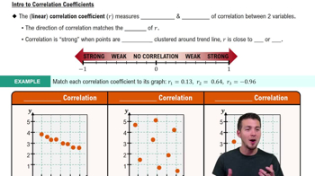
Correlation
Correlation refers to a statistical measure that describes the extent to which two variables change together. A positive correlation indicates that as one variable increases, the other also tends to increase, while a negative correlation suggests that as one variable increases, the other tends to decrease. Understanding correlation is crucial for interpreting scatterplots, as it helps determine the strength and direction of the relationship between the variables.
Recommended video:
Guided course
 05:43
05:43Correlation Coefficient
Descriptive Statistics
Descriptive statistics summarize and describe the main features of a dataset. This includes measures such as mean, median, mode, and standard deviation, which provide insights into the central tendency and variability of the data. In the context of the body temperature measurements, descriptive statistics can help analyze the overall trends and patterns in the temperatures recorded at 8 AM and 12 AM, aiding in the interpretation of the scatterplot.
Recommended video:
Guided course
 05:53
05:53Parameters vs. Statistics
 4:39m
4:39mWatch next
Master Visualizing Qualitative vs. Quantitative Data with a bite sized video explanation from Patrick
Start learning


