Table of contents
- 1. Intro to Stats and Collecting Data55m
- 2. Describing Data with Tables and Graphs1h 55m
- 3. Describing Data Numerically1h 45m
- 4. Probability2h 16m
- 5. Binomial Distribution & Discrete Random Variables2h 33m
- 6. Normal Distribution and Continuous Random Variables1h 38m
- 7. Sampling Distributions & Confidence Intervals: Mean1h 3m
- 8. Sampling Distributions & Confidence Intervals: Proportion1h 12m
- 9. Hypothesis Testing for One Sample1h 1m
- 10. Hypothesis Testing for Two Samples2h 8m
- 11. Correlation48m
- 12. Regression1h 4m
- 13. Chi-Square Tests & Goodness of Fit1h 20m
- 14. ANOVA1h 0m
2. Describing Data with Tables and Graphs
Visualizing Qualitative vs. Quantitative Data
Problem 2.RE.6a
Textbook Question
Environment
a. After collecting the average (mean) global temperatures for each of the most recent 100 years, we want to construct the graph that is most appropriate for these data. Which graph is best?
 Verified step by step guidance
1
Determine the type of data: The data consists of average global temperatures collected over 100 years. This is quantitative data (numerical) and is measured over time, making it a time series.
Identify the purpose of the graph: Since the goal is to visualize how the average global temperatures have changed over time, the graph should clearly show trends and patterns.
Choose the most appropriate graph: For time series data, a line graph is typically the best choice because it effectively displays changes and trends over time by connecting data points with lines.
Label the axes: On the x-axis, place the years (time), and on the y-axis, place the average global temperatures. Ensure the units for temperature (e.g., °C or °F) are clearly indicated.
Plot the data: Use the collected data points to create the graph, connecting them with lines to show the trend of global temperatures over the 100-year period. Ensure the graph is properly titled and includes a legend if necessary.
 Verified video answer for a similar problem:
This video solution was recommended by our tutors as helpful for the problem above
Video duration:
1mPlay a video:
Was this helpful?
Key Concepts
Here are the essential concepts you must grasp in order to answer the question correctly.
Mean
The mean, or average, is a measure of central tendency that summarizes a set of values by dividing the sum of all values by the number of values. In the context of global temperatures, calculating the mean provides a single representative value that reflects the overall trend in temperature changes over the specified period.
Recommended video:
Guided course

Calculating the Mean
Graph Types
Different types of graphs serve various purposes in data visualization. For time series data, such as average global temperatures over 100 years, line graphs are often the most effective, as they clearly show trends and changes over time, allowing for easy comparison of values across the years.
Recommended video:

Creating Time-Series Graphs
Data Visualization
Data visualization is the graphical representation of information and data. It helps in understanding complex data sets by presenting them in a visual context, such as charts or graphs, making it easier to identify patterns, trends, and outliers in the data, which is crucial for interpreting the average global temperatures.
Recommended video:
Guided course

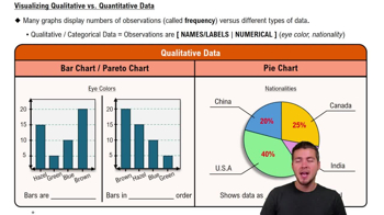
Visualizing Qualitative vs. Quantitative Data

 4:39m
4:39mWatch next
Master Visualizing Qualitative vs. Quantitative Data with a bite sized video explanation from Patrick
Start learning


