Table of contents
- 1. Intro to Stats and Collecting Data55m
- 2. Describing Data with Tables and Graphs1h 55m
- 3. Describing Data Numerically1h 45m
- 4. Probability2h 16m
- 5. Binomial Distribution & Discrete Random Variables2h 33m
- 6. Normal Distribution and Continuous Random Variables1h 38m
- 7. Sampling Distributions & Confidence Intervals: Mean1h 3m
- 8. Sampling Distributions & Confidence Intervals: Proportion1h 12m
- 9. Hypothesis Testing for One Sample1h 1m
- 10. Hypothesis Testing for Two Samples2h 8m
- 11. Correlation48m
- 12. Regression1h 4m
- 13. Chi-Square Tests & Goodness of Fit1h 20m
- 14. ANOVA1h 0m
2. Describing Data with Tables and Graphs
Visualizing Qualitative vs. Quantitative Data
Problem 2.RE.7
Textbook Question
It’s Like Time to Do This Exercise In a Marist survey of adults, these are the words or phrases that subjects find most annoying in conversation (along with their frequencies of response): like (127); just sayin’ (81); you know (104); whatever (219); obviously (35). Construct a pie chart. Identify one disadvantage of a pie chart.
 Verified step by step guidance
1
Step 1: Calculate the total frequency by summing up all the given frequencies: 127 (like) + 81 (just sayin’) + 104 (you know) + 219 (whatever) + 35 (obviously). This total will represent the entire dataset.
Step 2: For each category, calculate the proportion of the total frequency it represents. Use the formula: Proportion = (Frequency of the category) / (Total frequency). For example, for 'like', the proportion would be 127 / Total frequency.
Step 3: Convert each proportion into a percentage by multiplying it by 100. For example, the percentage for 'like' would be (127 / Total frequency) √ó 100.
Step 4: Use the percentages to determine the angle for each category in the pie chart. Use the formula: Angle = (Percentage / 100) × 360°. For example, the angle for 'like' would be ((127 / Total frequency) × 100) × 360°.
Step 5: Draw the pie chart by dividing the circle into slices based on the calculated angles for each category. Label each slice with the corresponding category and percentage. A disadvantage of a pie chart is that it can be difficult to compare the sizes of slices accurately, especially when the differences are small.
 Verified video answer for a similar problem:
This video solution was recommended by our tutors as helpful for the problem above
Video duration:
2mPlay a video:
Was this helpful?
Key Concepts
Here are the essential concepts you must grasp in order to answer the question correctly.
Pie Chart
A pie chart is a circular statistical graphic that is divided into slices to illustrate numerical proportions. Each slice represents a category's contribution to the total, making it easy to visualize relative sizes. In the context of the survey, each annoying phrase's frequency can be represented as a slice of the pie, allowing for quick comparisons of how often each phrase is mentioned.
Recommended video:

Creating Pie Charts
Data Visualization
Data visualization is the graphical representation of information and data. By using visual elements like charts, graphs, and maps, it helps to make complex data more accessible and understandable. Effective data visualization can reveal patterns, trends, and insights that might not be immediately apparent in raw data, which is crucial when interpreting survey results.
Recommended video:
Guided course

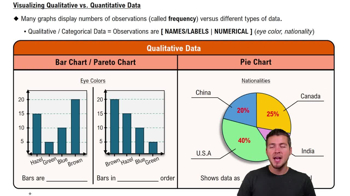
Visualizing Qualitative vs. Quantitative Data
Disadvantages of Pie Charts
One disadvantage of pie charts is that they can be misleading when comparing similar-sized slices, as small differences in size can be hard to discern visually. Additionally, pie charts do not effectively convey changes over time or the exact values of each category, which can limit their usefulness in certain analytical contexts. This can lead to misinterpretation of the data presented.
Recommended video:

Creating Pie Charts

 4:39m
4:39mWatch next
Master Visualizing Qualitative vs. Quantitative Data with a bite sized video explanation from Patrick
Start learning


