Table of contents
- 1. Intro to Stats and Collecting Data55m
- 2. Describing Data with Tables and Graphs1h 55m
- 3. Describing Data Numerically1h 45m
- 4. Probability2h 16m
- 5. Binomial Distribution & Discrete Random Variables2h 33m
- 6. Normal Distribution and Continuous Random Variables1h 38m
- 7. Sampling Distributions & Confidence Intervals: Mean1h 3m
- 8. Sampling Distributions & Confidence Intervals: Proportion1h 12m
- 9. Hypothesis Testing for One Sample1h 1m
- 10. Hypothesis Testing for Two Samples2h 8m
- 11. Correlation48m
- 12. Regression1h 4m
- 13. Chi-Square Tests & Goodness of Fit1h 20m
- 14. ANOVA1h 0m
2. Describing Data with Tables and Graphs
Visualizing Qualitative vs. Quantitative Data
Problem 2.RE.8
Textbook Question
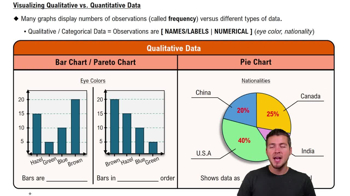
Whatever Use the same data from Exercise 7 to construct a Pareto chart. Which graph does a better job of illustrating the data: Pareto chart or pie chart?
 Verified step by step guidance
1
Identify the data from Exercise 7. Ensure you have the categories and their corresponding frequencies or counts. A Pareto chart requires this information to rank the categories in descending order of frequency.
Sort the categories in descending order based on their frequencies. This is a key feature of a Pareto chart, as it highlights the most significant categories first.
Calculate the cumulative frequency for each category. This is done by adding the frequency of the current category to the sum of the frequencies of all previous categories.
Create the Pareto chart by plotting the categories on the x-axis and their frequencies on the left y-axis. Use bars to represent the frequencies. Additionally, plot the cumulative frequency as a line graph on the same chart, using the right y-axis for the cumulative percentage scale.
Compare the Pareto chart to the pie chart. Evaluate which graph better illustrates the data by considering factors such as clarity, ease of identifying the most significant categories, and the ability to observe cumulative effects.
 Verified video answer for a similar problem:
This video solution was recommended by our tutors as helpful for the problem above
Video duration:
3mPlay a video:
Was this helpful?
Key Concepts
Here are the essential concepts you must grasp in order to answer the question correctly.
Pareto Chart
A Pareto chart is a type of bar graph that represents the frequency or impact of problems in a descending order, often combined with a line graph showing the cumulative total. It is based on the Pareto principle, which states that roughly 80% of effects come from 20% of causes. This visualization helps identify the most significant factors in a dataset, making it easier to prioritize actions.
Recommended video:

Creating Bar Graphs and Pareto Charts
Pie Chart
A pie chart is a circular statistical graphic divided into slices to illustrate numerical proportions. Each slice represents a category's contribution to the whole, making it easy to see relative sizes at a glance. However, pie charts can become difficult to interpret when there are many categories or when the differences between them are subtle.
Recommended video:

Creating Pie Charts
Data Visualization
Data visualization is the graphical representation of information and data, using visual elements like charts, graphs, and maps. It helps to communicate complex data clearly and effectively, allowing for easier interpretation and insight extraction. Choosing the right type of visualization, such as a Pareto chart or pie chart, is crucial for accurately conveying the underlying patterns and trends in the data.
Recommended video:
Guided course

Visualizing Qualitative vs. Quantitative Data

 4:39m
4:39mWatch next
Master Visualizing Qualitative vs. Quantitative Data with a bite sized video explanation from Patrick
Start learning


