Table of contents
- 1. Intro to Stats and Collecting Data55m
- 2. Describing Data with Tables and Graphs1h 55m
- 3. Describing Data Numerically1h 45m
- 4. Probability2h 16m
- 5. Binomial Distribution & Discrete Random Variables2h 33m
- 6. Normal Distribution and Continuous Random Variables1h 38m
- 7. Sampling Distributions & Confidence Intervals: Mean1h 3m
- 8. Sampling Distributions & Confidence Intervals: Proportion1h 12m
- 9. Hypothesis Testing for One Sample1h 1m
- 10. Hypothesis Testing for Two Samples2h 8m
- 11. Correlation48m
- 12. Regression1h 4m
- 13. Chi-Square Tests & Goodness of Fit1h 20m
- 14. ANOVA1h 0m
2. Describing Data with Tables and Graphs
Visualizing Qualitative vs. Quantitative Data
Problem 4.CRE.5
Textbook Question
Heights of Presidents Theories have been developed about the heights of winning candidates for the U.S. presidency and the heights of candidates who were runners up. Listed below are heights (cm) from recent presidential elections. Construct a graph suitable for exploring an association between heights of presidents and the heights of the presidential candidates who were runners-up. What does the graph suggest about that association?

 Verified step by step guidance
1
Step 1: Identify the type of graph suitable for exploring the association between the heights of winners and runners-up. A scatter plot is ideal for visualizing the relationship between two numerical variables, such as the heights of winners and runners-up.
Step 2: Label the axes of the scatter plot. The x-axis can represent the heights of the winners (in cm), and the y-axis can represent the heights of the runners-up (in cm). This ensures clarity in interpreting the graph.
Step 3: Plot the data points on the scatter plot. For each pair of heights (winner and runner-up), plot a point where the x-coordinate corresponds to the winner's height and the y-coordinate corresponds to the runner-up's height. For example, the first pair (182, 180) would be plotted as (182, 180).
Step 4: Analyze the pattern of the points on the scatter plot. Look for trends, such as whether the points tend to cluster along a diagonal line, which would suggest a positive association between the heights of winners and runners-up.
Step 5: Interpret the graph. If the points show a clear trend (e.g., taller winners tend to have taller runners-up), this suggests a positive association. If the points are scattered without a clear pattern, it suggests no strong association between the heights of winners and runners-up.
 Verified video answer for a similar problem:
This video solution was recommended by our tutors as helpful for the problem above
Video duration:
3mPlay a video:
Was this helpful?
Key Concepts
Here are the essential concepts you must grasp in order to answer the question correctly.
Scatter Plot
A scatter plot is a graphical representation used to display the relationship between two quantitative variables. In this context, it can be used to plot the heights of winning presidential candidates against the heights of their runners-up. Each point on the graph represents a pair of heights, allowing for visual assessment of any correlation or trend between the two sets of data.
Recommended video:

Creating Dotplots
Correlation
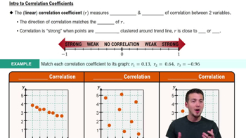
Correlation measures the strength and direction of a linear relationship between two variables. In this case, it helps to determine whether taller winning candidates tend to have taller or shorter runners-up. A positive correlation would suggest that as the height of winners increases, so does the height of runners-up, while a negative correlation would indicate the opposite.
Recommended video:
Guided course

Correlation Coefficient
Descriptive Statistics
Descriptive statistics summarize and describe the main features of a dataset. For the heights of presidents and their runners-up, measures such as mean, median, and range can provide insights into the overall height trends. Understanding these statistics is essential for interpreting the data accurately and making informed conclusions about the association between the two groups.
Recommended video:
Guided course

Parameters vs. Statistics

 4:39m
4:39mWatch next
Master Visualizing Qualitative vs. Quantitative Data with a bite sized video explanation from Patrick
Start learning


