2. Describing Data with Tables and Graphs
Histograms
Problem 2.2.7
Textbook Question
In Exercises 5–8, answer the questions by referring to the following Minitab-generated histogram, which depicts the weights (grams) of all quarters listed in Data Set 40 “Coin Weights” in Appendix B. (Grams are actually units of mass and the values shown on the horizontal scale are rounded.)
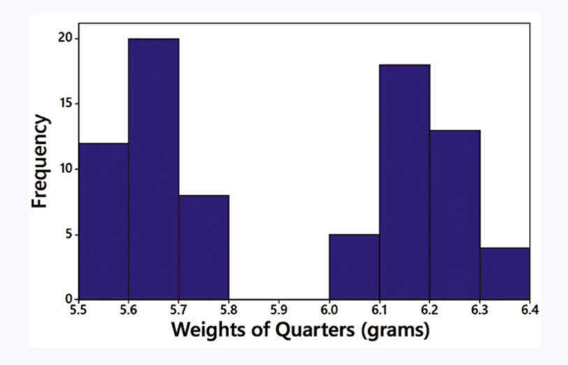
Relative Frequency Histogram How would the shape of the histogram change if the vertical scale uses relative frequencies expressed in percentages instead of the actual frequency counts as shown here?
 Verified step by step guidance
1
Step 1: Understand the difference between frequency and relative frequency. Frequency represents the count of occurrences in each bin, while relative frequency represents the proportion of occurrences in each bin relative to the total number of data points. Relative frequency can be expressed as a percentage.
Step 2: Calculate the relative frequency for each bin by dividing the frequency of each bin by the total number of data points and then multiplying by 100 to express it as a percentage. For example, if a bin has a frequency of 20 and the total number of data points is 100, the relative frequency would be (20/100) * 100 = 20%.
Step 3: Replace the vertical axis labels with percentages instead of raw frequency counts. The shape of the histogram will remain the same because the relative frequency is proportional to the frequency, but the scale on the vertical axis will change to reflect percentages.
Step 4: Interpret the histogram with the new vertical scale. The heights of the bars will now represent the percentage of the total data points that fall within each bin, rather than the raw count.
Step 5: Note that the overall visual appearance of the histogram (the distribution shape) does not change, as the relative frequency is directly proportional to the frequency. The change is only in the labeling of the vertical axis.
Verified video answer for a similar problem:This video solution was recommended by our tutors as helpful for the problem above
Video duration:
2mWas this helpful?
Key Concepts
Here are the essential concepts you must grasp in order to answer the question correctly.
Histogram
A histogram is a graphical representation of the distribution of numerical data, where the data is divided into intervals (bins) and the frequency of data points within each interval is represented by the height of bars. In this case, the histogram shows the frequency of quarter weights in grams, allowing for visual analysis of weight distribution.
Recommended video:
Guided course

 05:54
05:54Intro to Histograms
Relative Frequency
Relative frequency is the ratio of the frequency of a particular value or range of values to the total number of observations. It is often expressed as a percentage, providing a way to compare different categories or intervals on a common scale. If the histogram were to use relative frequencies, the heights of the bars would reflect the proportion of total weights rather than absolute counts.
Recommended video:
Guided course
 06:38
06:38Intro to Frequency Distributions
Shape of the Histogram
The shape of a histogram refers to the overall pattern formed by the bars, which can indicate the distribution of the data (e.g., normal, skewed, bimodal). Changing the vertical scale to relative frequencies may alter the perceived shape, as it emphasizes the proportion of weights rather than their raw counts, potentially highlighting different aspects of the data distribution.
Recommended video:
Guided course
05:54Intro to Histograms

Related Videos
Related Practice

