Table of contents
- 1. Intro to Stats and Collecting Data55m
- 2. Describing Data with Tables and Graphs1h 55m
- 3. Describing Data Numerically1h 45m
- 4. Probability2h 16m
- 5. Binomial Distribution & Discrete Random Variables2h 33m
- 6. Normal Distribution and Continuous Random Variables1h 38m
- 7. Sampling Distributions & Confidence Intervals: Mean1h 3m
- 8. Sampling Distributions & Confidence Intervals: Proportion1h 12m
- 9. Hypothesis Testing for One Sample1h 1m
- 10. Hypothesis Testing for Two Samples2h 8m
- 11. Correlation48m
- 12. Regression1h 4m
- 13. Chi-Square Tests & Goodness of Fit1h 20m
- 14. ANOVA1h 0m
2. Describing Data with Tables and Graphs
Visualizing Qualitative vs. Quantitative Data
Problem 2.DS.2a
Textbook Question
You are a member of your local apartment association. The association represents rental housing owners and managers who operate residential rental property throughout the greater metropolitan area. Recently, the association has received several complaints from tenants in a particular area of the city who feel that their monthly rental fees are much higher compared to other parts of the city.
You want to investigate the rental fees. You gather the data shown in the table at the right. Area A represents the area of the city where tenants are unhappy about their monthly rents. The data represent the monthly rents paid by a random sample of tenants in Area A and three other areas of similar size. Assume all the apartments represented are approximately the same size with the same amenities.

a. What type of graph would you choose to display the data? Explain your reasoning.
 Verified step by step guidance
1
Step 1: Identify the type of data provided. The table contains numerical data representing monthly rental fees for tenants in four different areas (Area A, Area B, Area C, and Area D). Each column corresponds to a specific area, and each row represents a sample observation.
Step 2: Consider the purpose of the graph. Since the goal is to compare rental fees across different areas and investigate whether Area A has higher rents, a graph that allows for easy comparison of distributions is ideal.
Step 3: Choose an appropriate graph type. A box-and-whisker plot (boxplot) is a suitable choice because it visually summarizes the distribution of rental fees for each area, showing measures like the median, quartiles, and potential outliers. This helps identify differences in central tendency and variability between areas.
Step 4: Explain why a boxplot is effective. A boxplot provides a clear visual comparison of the spread and center of the data for each area. It highlights whether Area A has higher rents compared to other areas by showing the median and range of values. Additionally, it can reveal if there are outliers in the data.
Step 5: Prepare the data for graphing. Organize the rental fees for each area and calculate the necessary statistics (minimum, first quartile, median, third quartile, and maximum) to construct the boxplot. Ensure the data is grouped by area for clarity in the graph.
 Verified video answer for a similar problem:
This video solution was recommended by our tutors as helpful for the problem above
Video duration:
2mPlay a video:
Was this helpful?
Key Concepts
Here are the essential concepts you must grasp in order to answer the question correctly.
Data Visualization
Data visualization is the graphical representation of information and data. By using visual elements like charts, graphs, and maps, it helps to make complex data more accessible and understandable. In this context, choosing the right type of graph is crucial to effectively communicate the differences in rental fees across different areas.
Recommended video:
Guided course

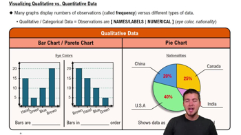
Visualizing Qualitative vs. Quantitative Data
Comparative Analysis
Comparative analysis involves evaluating two or more items to identify similarities and differences. In this scenario, it is essential to compare the rental fees from Area A with those from Areas B, C, and D to determine if the complaints about higher rents are justified. This analysis can reveal trends and patterns in rental pricing across different areas.
Recommended video:
Guided course

Comparing Mean vs. Median
Descriptive Statistics
Descriptive statistics summarize and describe the main features of a dataset. Key measures include mean, median, mode, and range, which provide insights into the central tendency and variability of rental prices. Understanding these statistics is vital for interpreting the data and making informed decisions based on the rental fee comparisons.
Recommended video:
Guided course

Parameters vs. Statistics

 4:39m
4:39mWatch next
Master Visualizing Qualitative vs. Quantitative Data with a bite sized video explanation from Patrick
Start learning


