6. Normal Distribution and Continuous Random Variables
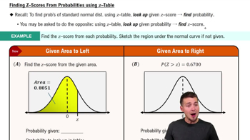
Standard Normal Distribution
Problem 5.2.21
Textbook Question
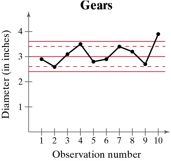
In Exercises 21–24, a control chart is shown. Each chart has horizontal lines drawn at the mean mu, at mu ±2sigma, and at mu±3sigma. Determine whether the process shown is in control or out of control. Explain.
A gear has been designed to have a diameter of 3 inches. The standard deviation of the process is 0.2 inch.
 Verified step by step guidance
1
Step 1: Understand the control chart. The chart shows the diameter of gears across 10 observations. The horizontal lines represent the mean (μ = 3 inches), μ ± 2σ, and μ ± 3σ, where σ = 0.2 inches.
Step 2: Calculate the control limits. The upper control limit (UCL) is μ + 3σ = 3 + 3(0.2) = 3.6 inches, and the lower control limit (LCL) is μ - 3σ = 3 - 3(0.2) = 2.4 inches. Points outside these limits indicate the process is out of control.
Step 3: Analyze the data points. Observe whether any points fall outside the control limits (above 3.6 or below 2.4 inches). In the chart, the 10th observation exceeds the UCL, indicating a potential issue.
Step 4: Check for patterns. Even if all points are within the control limits, patterns such as trends, cycles, or sudden shifts can indicate the process is out of control. In this case, the 10th observation is an outlier, suggesting the process may be out of control.
Step 5: Conclude the analysis. Based on the observation of the 10th point exceeding the UCL, the process is likely out of control. Further investigation is needed to identify the cause of this deviation.
Verified video answer for a similar problem:This video solution was recommended by our tutors as helpful for the problem above
Video duration:
5mWas this helpful?
Key Concepts
Here are the essential concepts you must grasp in order to answer the question correctly.
Control Chart
A control chart is a statistical tool used to monitor the stability of a process over time. It displays data points in time order and includes control limits, typically set at the mean plus or minus two and three standard deviations. This helps identify variations in the process, distinguishing between common cause variation (in control) and special cause variation (out of control).
Recommended video:

 06:10
06:10Creating Pie Charts
Mean and Standard Deviation
The mean is the average value of a dataset, representing the central tendency, while the standard deviation measures the dispersion or spread of the data points around the mean. In the context of control charts, the mean serves as the center line, and the standard deviation is used to calculate the control limits, which help assess whether the process is operating within expected parameters.
Recommended video:
Guided course
 08:45
08:45Calculating Standard Deviation
In Control vs. Out of Control
A process is considered 'in control' if the data points fall within the control limits and show no patterns or trends, indicating that variations are due to common causes. Conversely, a process is 'out of control' if data points fall outside the control limits or display non-random patterns, suggesting the presence of special causes that require investigation and correction.
Recommended video:
Guided course
 04:39
04:39Visualizing Qualitative vs. Quantitative Data
 9:47m
9:47mWatch next
Master Finding Standard Normal Probabilities using z-Table with a bite sized video explanation from Patrick
Start learning