2. Describing Data with Tables and Graphs
Histograms
Problem 2.c.3
Textbook Question
In Exercises 1–5, use the data listed in the margin, which are magnitudes (Richter scale) and depths (km) of earthquakes from Data Set 24 “Earthquakes” in Appendix B
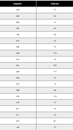
Histogram Construct the histogram corresponding to the frequency distribution from Exercise 1. For the values on the horizontal axis, use the class midpoint values. Which of the following comes closest to describing the distribution: uniform, normal, skewed left, skewed right?
 Verified step by step guidance
1
Organize the data into a frequency distribution table by dividing the magnitudes into appropriate class intervals. For each interval, count the number of earthquakes that fall within that range.
Calculate the class midpoints for each class interval. The class midpoint is the average of the lower and upper boundaries of the class interval. Use the formula: midpoint = (lower boundary + upper boundary) / 2.
Construct the histogram by plotting the class midpoints on the horizontal axis and the corresponding frequencies on the vertical axis. Each bar's height should represent the frequency of earthquakes in that class interval.
Analyze the shape of the histogram. Look for patterns such as symmetry, skewness, or uniformity. For example, if the histogram has a bell-shaped curve, it may indicate a normal distribution. If the bars are higher on one side, it may indicate skewness (left or right).
Based on the histogram's shape, determine whether the distribution is uniform, normal, skewed left, or skewed right. Provide reasoning for your conclusion based on the visual analysis of the histogram.
Verified video answer for a similar problem:This video solution was recommended by our tutors as helpful for the problem above
Video duration:
4mWas this helpful?
Key Concepts
Here are the essential concepts you must grasp in order to answer the question correctly.
Histogram
A histogram is a graphical representation of the distribution of numerical data, where the data is divided into intervals (bins) and the frequency of data points within each interval is represented by the height of bars. In this context, the histogram will display the frequency distribution of earthquake magnitudes, allowing for visual analysis of how often different magnitude ranges occur.
Recommended video:
Guided course

 05:54
05:54Intro to Histograms
Class Midpoint
The class midpoint is the value that lies in the middle of a class interval in a frequency distribution. It is calculated by averaging the upper and lower boundaries of the class. In constructing the histogram for the earthquake data, using class midpoints on the horizontal axis helps to accurately represent the central tendency of the data within each interval.
Recommended video:
 04:15
04:15Frequency Polygons Example 1
Distribution Shape
The shape of a distribution describes how data points are spread across different values. Common shapes include uniform, normal, skewed left, and skewed right. Understanding the distribution shape is crucial for interpreting the histogram, as it provides insights into the underlying patterns of the data, such as whether most earthquakes are of low or high magnitude.
Recommended video:
 05:11
05:11Sampling Distribution of Sample Proportion

Related Videos
Related Practice

