Table of contents
- 1. Intro to Stats and Collecting Data55m
- 2. Describing Data with Tables and Graphs1h 55m
- 3. Describing Data Numerically1h 45m
- 4. Probability2h 16m
- 5. Binomial Distribution & Discrete Random Variables2h 33m
- 6. Normal Distribution and Continuous Random Variables1h 38m
- 7. Sampling Distributions & Confidence Intervals: Mean1h 3m
- 8. Sampling Distributions & Confidence Intervals: Proportion1h 12m
- 9. Hypothesis Testing for One Sample1h 1m
- 10. Hypothesis Testing for Two Samples2h 8m
- 11. Correlation48m
- 12. Regression1h 4m
- 13. Chi-Square Tests & Goodness of Fit1h 20m
- 14. ANOVA1h 0m
2. Describing Data with Tables and Graphs
Histograms
Problem 2.2.17
Textbook Question
In Exercises 9–18, construct the histograms and answer the given questions.
Analysis of Last Digits Use the frequency distribution from Exercise 21 in Section 2-1 to construct a histogram. What can be concluded from the distribution of the digits? Specifically, do the heights appear to be reported or actually measured?
 Verified step by step guidance
1
Obtain the frequency distribution from Exercise 21 in Section 2-1. This table should list the last digits (e.g., 0 through 9) and their corresponding frequencies. Ensure you have this data ready for analysis.
Set up the axes for the histogram: The x-axis will represent the last digits (0 through 9), and the y-axis will represent the frequencies. Label both axes appropriately.
For each last digit, draw a bar whose height corresponds to its frequency. Ensure the bars are of equal width and are adjacent to each other without gaps, as this is a key feature of histograms.
Analyze the shape of the histogram. Look for patterns such as uniformity (all bars roughly the same height), peaks, or irregularities. This will help determine whether the data appears to be naturally measured or artificially reported.
Interpret the results: If the histogram shows a uniform distribution, it suggests the digits are likely measured. If certain digits (e.g., 0 or 5) appear more frequently, it may indicate that the heights were rounded or reported rather than precisely measured.
 Verified video answer for a similar problem:
This video solution was recommended by our tutors as helpful for the problem above
Video duration:
2mPlay a video:
Was this helpful?
Key Concepts
Here are the essential concepts you must grasp in order to answer the question correctly.
Histogram
A histogram is a graphical representation of the distribution of numerical data, where the data is divided into intervals (bins) and the frequency of data points within each interval is represented by the height of bars. This visual tool helps in understanding the shape, spread, and central tendency of the data, making it easier to identify patterns or anomalies.
Recommended video:
Guided course

Intro to Histograms
Frequency Distribution
A frequency distribution is a summary of how often each value occurs in a dataset. It organizes data into categories or intervals, allowing for a clear view of the data's distribution. This foundational concept is crucial for constructing histograms, as it provides the necessary counts for each bin that will be represented graphically.
Recommended video:
Guided course

Intro to Frequency Distributions
Reported vs. Measured Data
Reported data refers to values that are recorded or stated, often influenced by subjective factors or rounding, while measured data is obtained through direct observation or experimentation, reflecting actual values. Understanding the distinction between these types of data is essential for interpreting the histogram accurately, as it can affect the conclusions drawn about the distribution's reliability and validity.
Recommended video:
Guided course

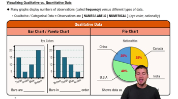
Visualizing Qualitative vs. Quantitative Data
Related Videos
Related Practice


