2. Describing Data with Tables and Graphs
Histograms
Problem 2.T.6
Textbook Question
The number of minutes it took 12 students in a statistics class to complete the final exam are listed. Use a scatter plot to display this data set and the data set in Exercise 1. The data sets are in the same order. Describe any patterns.
61 85 67 48 54 61 59 80 67 55 88 84
 Verified step by step guidance
1
Step 1: Organize the data into two variables. The first variable represents the student index (e.g., 1 through 12), and the second variable represents the time it took each student to complete the exam (e.g., 61, 85, 67, etc.).
Step 2: Create a scatter plot. On the x-axis, plot the student index (1 through 12), and on the y-axis, plot the corresponding exam completion times (61, 85, 67, etc.).
Step 3: Plot each data point on the scatter plot. For example, the first point will be (1, 61), the second point will be (2, 85), and so on, until the last point (12, 84).
Step 4: Observe the scatter plot to identify any patterns. Look for trends such as clustering, increasing or decreasing trends, or any outliers that deviate significantly from the rest of the data.
Step 5: Compare this scatter plot with the scatter plot from Exercise 1. Analyze whether the patterns in the two data sets are similar or different, and describe any notable observations.
Verified video answer for a similar problem:This video solution was recommended by our tutors as helpful for the problem above
Video duration:
2mWas this helpful?
Key Concepts
Here are the essential concepts you must grasp in order to answer the question correctly.
Scatter Plot
A scatter plot is a graphical representation that uses dots to represent the values obtained for two different variables, one plotted along the x-axis and the other along the y-axis. In this context, it will display the time taken by students to complete the exam, allowing for visual analysis of any correlation or patterns in the data.
Recommended video:
Guided course

 07:38
07:38Residuals and Residual Plots
Descriptive Statistics
Descriptive statistics summarize and describe the main features of a data set. This includes measures such as mean, median, mode, and range, which help in understanding the central tendency and variability of the exam completion times, providing context for any patterns observed in the scatter plot.
Recommended video:
Guided course
 05:53
05:53Parameters vs. Statistics
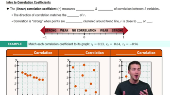
Correlation
Correlation refers to a statistical measure that describes the extent to which two variables change together. In the context of the scatter plot, identifying correlation can help determine if there is a relationship between the exam completion times of the students and any other variable, such as their performance or study habits.
Recommended video:
Guided course
 05:43
05:43Correlation Coefficient

Related Videos
Related Practice


