Table of contents
- 1. Intro to Stats and Collecting Data55m
- 2. Describing Data with Tables and Graphs1h 55m
- 3. Describing Data Numerically1h 45m
- 4. Probability2h 16m
- 5. Binomial Distribution & Discrete Random Variables2h 33m
- 6. Normal Distribution and Continuous Random Variables1h 38m
- 7. Sampling Distributions & Confidence Intervals: Mean1h 3m
- 8. Sampling Distributions & Confidence Intervals: Proportion1h 12m
- 9. Hypothesis Testing for One Sample1h 1m
- 10. Hypothesis Testing for Two Samples2h 8m
- 11. Correlation48m
- 12. Regression1h 4m
- 13. Chi-Square Tests & Goodness of Fit1h 20m
- 14. ANOVA1h 0m
2. Describing Data with Tables and Graphs
Visualizing Qualitative vs. Quantitative Data
Problem 2.3.22
Textbook Question
V and Digital Ads Listed below are amounts (billions of dollars) spent on TV and digital advertising. The amounts are listed in order by year ending with the year 2022. The last few years are projected amounts (based on data from Magna Global). Construct a graph that reveals the story that the data are trying to tell. What story does the graph depict?
TV Ads:

[Image]
 Verified step by step guidance
1
Step 1: Organize the data into two separate series: one for TV advertising and one for digital advertising. Ensure the years are aligned with the corresponding values for each type of advertising.
Step 2: Choose an appropriate graph type to visualize the data. A line graph is ideal for showing trends over time, as it allows for easy comparison between the two series.
Step 3: Plot the years on the x-axis and the advertising amounts (in billions of dollars) on the y-axis. Use one line for TV advertising and another line for digital advertising, ensuring they are clearly labeled.
Step 4: Add a legend to the graph to distinguish between TV and digital advertising. Include axis labels and a title that reflects the purpose of the graph, such as 'Trends in TV and Digital Advertising Spending Over Time'.
Step 5: Analyze the graph to interpret the story it tells. Look for patterns, such as whether spending on TV advertising is increasing, decreasing, or stabilizing, and compare it to the trend in digital advertising spending. Highlight any significant changes or projections for future years.
 Verified video answer for a similar problem:
This video solution was recommended by our tutors as helpful for the problem above
Video duration:
3mPlay a video:
Was this helpful?
Key Concepts
Here are the essential concepts you must grasp in order to answer the question correctly.
Data Visualization
Data visualization is the graphical representation of information and data. By using visual elements like charts, graphs, and maps, it helps to communicate complex data clearly and efficiently. In the context of the question, constructing a graph from the advertising spending data allows for an easier interpretation of trends and comparisons over time.
Recommended video:
Guided course

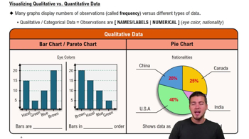
Visualizing Qualitative vs. Quantitative Data
Trend Analysis
Trend analysis involves examining data over a period to identify patterns or trends. In this case, analyzing the spending on TV and digital advertising from 2010 to 2022 can reveal whether advertising budgets are increasing or decreasing, and how the shift between TV and digital platforms is evolving. This understanding is crucial for making informed marketing decisions.
Recommended video:

Creating Time-Series Graphs
Projected Data
Projected data refers to estimates of future values based on historical data trends. In the provided data, the amounts for the last few years are projections, which are important for forecasting future advertising spending. Understanding how projections are made and their implications can help in assessing the potential growth or decline in advertising investments.
Recommended video:
Guided course

Visualizing Qualitative vs. Quantitative Data

 4:39m
4:39mWatch next
Master Visualizing Qualitative vs. Quantitative Data with a bite sized video explanation from Patrick
Start learning


