Table of contents
- 1. Intro to Stats and Collecting Data55m
- 2. Describing Data with Tables and Graphs1h 55m
- 3. Describing Data Numerically1h 45m
- 4. Probability2h 16m
- 5. Binomial Distribution & Discrete Random Variables2h 33m
- 6. Normal Distribution and Continuous Random Variables1h 38m
- 7. Sampling Distributions & Confidence Intervals: Mean1h 3m
- 8. Sampling Distributions & Confidence Intervals: Proportion1h 12m
- 9. Hypothesis Testing for One Sample1h 1m
- 10. Hypothesis Testing for Two Samples2h 8m
- 11. Correlation48m
- 12. Regression1h 4m
- 13. Chi-Square Tests & Goodness of Fit1h 20m
- 14. ANOVA1h 0m
2. Describing Data with Tables and Graphs
Visualizing Qualitative vs. Quantitative Data
Problem 2.CQQ.6
Textbook Question
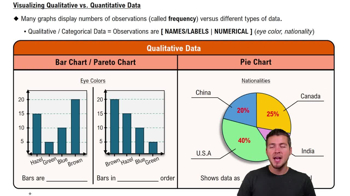
Computers As a quality control manager at Texas Instruments, you find that defective calculators have various causes, including worn machinery, human error, bad supplies, and packaging mistreatment. Which of the following graphs would be best for describing the causes of defects: histogram; scatterplot; Pareto chart; dotplot; pie chart?
 Verified step by step guidance
1
Understand the purpose of the graph: The goal is to describe the causes of defects and their relative frequencies or importance. This requires a graph that can effectively display categorical data and highlight the most significant causes.
Review the options: A histogram is used for continuous numerical data, a scatterplot shows relationships between two numerical variables, a dotplot is for small datasets, and a pie chart shows proportions. A Pareto chart, however, is specifically designed to display categorical data in descending order of frequency or importance.
Recall the Pareto principle: The Pareto chart is based on the 80/20 rule, which states that a small number of causes often account for the majority of problems. This makes it ideal for identifying the most significant causes of defects.
Explain the structure of a Pareto chart: It combines a bar graph (to show the frequency of each cause) and a line graph (to show the cumulative percentage). The bars are arranged in descending order of frequency, making it easy to identify the most critical causes.
Conclude that the Pareto chart is the best choice: Since the problem involves identifying and describing the causes of defects, the Pareto chart is the most effective tool for this purpose. It allows the quality control manager to prioritize efforts on the most significant causes.
 Verified video answer for a similar problem:
This video solution was recommended by our tutors as helpful for the problem above
Video duration:
3mPlay a video:
Was this helpful?
Key Concepts
Here are the essential concepts you must grasp in order to answer the question correctly.
Pareto Chart
A Pareto chart is a type of bar graph that represents the frequency or impact of problems in descending order. It is based on the Pareto principle, which states that roughly 80% of effects come from 20% of causes. This chart is particularly useful in quality control to identify the most significant factors contributing to defects, allowing managers to prioritize their efforts effectively.
Recommended video:

Creating Bar Graphs and Pareto Charts
Histogram
A histogram is a graphical representation of the distribution of numerical data, showing the frequency of data points within specified ranges (bins). While useful for understanding the distribution of a single variable, it is less effective for categorizing and comparing multiple causes of defects, making it less suitable for this context.
Recommended video:
Guided course

Intro to Histograms
Pie Chart
A pie chart is a circular statistical graphic divided into slices to illustrate numerical proportions. Each slice represents a category's contribution to the whole. While it can show the relative sizes of different causes of defects, it may not effectively convey the priority or impact of each cause, especially when there are many categories.
Recommended video:

Creating Pie Charts

 4:39m
4:39mWatch next
Master Visualizing Qualitative vs. Quantitative Data with a bite sized video explanation from Patrick
Start learning


