Table of contents
- 1. Intro to Stats and Collecting Data55m
- 2. Describing Data with Tables and Graphs1h 55m
- 3. Describing Data Numerically1h 45m
- 4. Probability2h 16m
- 5. Binomial Distribution & Discrete Random Variables2h 33m
- 6. Normal Distribution and Continuous Random Variables1h 38m
- 7. Sampling Distributions & Confidence Intervals: Mean1h 3m
- 8. Sampling Distributions & Confidence Intervals: Proportion1h 12m
- 9. Hypothesis Testing for One Sample1h 1m
- 10. Hypothesis Testing for Two Samples2h 8m
- 11. Correlation48m
- 12. Regression1h 4m
- 13. Chi-Square Tests & Goodness of Fit1h 20m
- 14. ANOVA1h 0m
2. Describing Data with Tables and Graphs
Visualizing Qualitative vs. Quantitative Data
Problem 2.3.13
Textbook Question
In Exercises 13 and 14, construct the pie chart.
Box Office Boffo Use the data from Exercise 11 “Box Office Boffo.”
"Recent annual gross revenue (millions of dollars) for the leading movie studios are as follows: 20th Century Fox (1082), Buena Vista (3092), Paramount (757), Sony/Columbia (1304), Universal (1772), Warner Brothers (1941)."
 Verified step by step guidance
1
Step 1: Calculate the total gross revenue by summing up the values for all movie studios. Add the revenues: 1082 + 3092 + 757 + 1304 + 1772 + 1941.
Step 2: Determine the proportion of each studio's revenue relative to the total revenue. For each studio, divide its revenue by the total revenue calculated in Step 1. For example, for 20th Century Fox, calculate: (1082 / Total Revenue).
Step 3: Convert each proportion into a percentage by multiplying the result from Step 2 by 100. For example, for 20th Century Fox, calculate: (Proportion √ó 100).
Step 4: Calculate the angle for each sector of the pie chart. Since a pie chart represents 360 degrees, multiply each studio's proportion (from Step 2) by 360 to find the angle for its sector. For example, for 20th Century Fox, calculate: (Proportion √ó 360).
Step 5: Draw the pie chart using the angles calculated in Step 4. Label each sector with the studio name and its corresponding percentage (from Step 3). Ensure the chart visually represents the relative sizes of the revenues.
 Verified video answer for a similar problem:
This video solution was recommended by our tutors as helpful for the problem above
Video duration:
1mPlay a video:
Was this helpful?
Key Concepts
Here are the essential concepts you must grasp in order to answer the question correctly.
Pie Chart
A pie chart is a circular statistical graphic that is divided into slices to illustrate numerical proportions. Each slice represents a category's contribution to the total, making it easy to visualize relative sizes. In this context, the pie chart will display the gross revenue of different movie studios as parts of a whole, allowing for quick comparisons.
Recommended video:

Creating Pie Charts
Data Representation
Data representation involves organizing and presenting data in a visual format to facilitate understanding and analysis. In the case of the box office revenues, representing the data in a pie chart helps to convey the distribution of revenue among the studios clearly, highlighting which studios dominate the market and how they compare to one another.
Recommended video:
Guided course

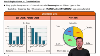
Visualizing Qualitative vs. Quantitative Data
Proportional Relationships
Proportional relationships refer to the way in which two quantities relate to each other in terms of their size or amount. In the context of the pie chart, the size of each slice corresponds to the proportion of each studio's revenue relative to the total revenue of all studios combined. Understanding these relationships is crucial for interpreting the pie chart accurately.
Recommended video:
Guided course

Difference in Proportions: Hypothesis Tests

 4:39m
4:39mWatch next
Master Visualizing Qualitative vs. Quantitative Data with a bite sized video explanation from Patrick
Start learning


