2. Describing Data with Tables and Graphs
Time-Series Graph
Struggling with Statistics for Business?
Join thousands of students who trust us to help them ace their exams!Watch the first videoMultiple Choice
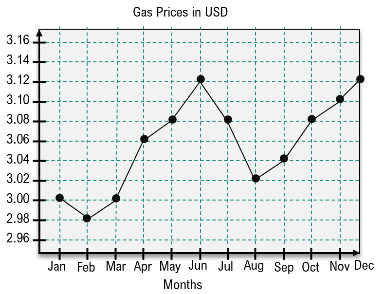
The time-series graph below gives the price (USD) of a gallon of gas each month over the course of a year. Find the time intervals during which gas prices are increasing.
A
Jan-Feb and Jun-Aug
B
Feb-Dec
C
Mar-Apr and May-Jun
D
Feb-Jun and Aug-Dec
 Verified step by step guidance
1
Step 1: Observe the time-series graph provided. The x-axis represents months from January to December, and the y-axis represents the price of gas in USD.
Step 2: Identify the intervals where the graph shows an upward trend, indicating an increase in gas prices. Look for sections where the line connecting the points slopes upward.
Step 3: From February to June, the graph shows a consistent upward trend, as the price increases from approximately $2.98 in February to $3.12 in June.
Step 4: From August to December, the graph again shows an upward trend, as the price increases from approximately $3.02 in August to $3.12 in December.
Step 5: Combine the identified intervals to conclude that the gas prices are increasing during the time intervals February to June and August to December.

 4:13m
4:13mWatch next
Master Creating Time-Series Graphs with a bite sized video explanation from Patrick
Start learningRelated Videos