2. Describing Data with Tables and Graphs
Frequency Polygons
Struggling with Statistics for Business?
Join thousands of students who trust us to help them ace their exams!Watch the first videoMultiple Choice
Using the frequency polygon below, what range of test scores was most popular?
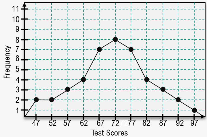
A
72
B
70-74
C
70.5-74.5
D
67-77
 Verified step by step guidance
1
Step 1: Observe the frequency polygon provided in the image. A frequency polygon is a graphical representation of data where points are plotted at the midpoints of intervals and connected by straight lines.
Step 2: Identify the peak of the frequency polygon, which represents the interval with the highest frequency. In this case, the peak occurs at the test score interval around 72, where the frequency is 9.
Step 3: Determine the range of test scores corresponding to this peak. The interval around 72 is typically represented as 70-74, based on the midpoint and the width of the intervals.
Step 4: Consider alternative representations of the interval, such as 70.5-74.5, which accounts for the boundaries of the interval in a continuous data context.
Step 5: Compare the given options (70-74, 70.5-74.5, 67-77) and select the one that best matches the interval with the highest frequency based on the frequency polygon.

 4:41m
4:41mWatch next
Master Creating Frequency Polygons with a bite sized video explanation from Patrick
Start learningRelated Videos