5. Binomial Distribution & Discrete Random Variables
Discrete Random Variables
Problem 4.T.5b
Textbook Question
The table shows the ages of students in a freshman orientation course.

b. Graph the probability distribution using a histogram and describe its shape.
 Verified step by step guidance
1
Step 1: Calculate the probability distribution. Divide the number of students for each age by the total number of students to find the probability for each age. For example, if there are 25 students in total, the probability for age 17 would be \( P(17) = \frac{2}{25} \). Repeat this for all ages.
Step 2: Create a histogram. On the x-axis, plot the ages (17, 18, 19, 20, 21, 22). On the y-axis, plot the probabilities calculated in Step 1. Each bar's height will correspond to the probability of the respective age.
Step 3: Label the histogram. Ensure the x-axis is labeled as 'Age' and the y-axis is labeled as 'Probability'. Add a title such as 'Probability Distribution of Student Ages'.
Step 4: Analyze the shape of the histogram. Observe whether the distribution is symmetric, skewed left, skewed right, or uniform. For example, if most probabilities are concentrated around a central age, the distribution might be symmetric.
Step 5: Summarize the shape. Based on the histogram, describe the overall pattern. For instance, if the probabilities decrease as age increases, the distribution might be skewed to the right.
Verified video answer for a similar problem:This video solution was recommended by our tutors as helpful for the problem above
Video duration:
2mWas this helpful?
Key Concepts
Here are the essential concepts you must grasp in order to answer the question correctly.
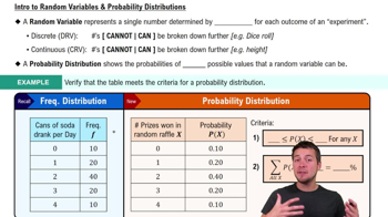
Probability Distribution
A probability distribution describes how the probabilities are distributed over the values of a random variable. In this context, it represents the likelihood of each age occurring among the students in the orientation course. The distribution can be visualized using a histogram, where the x-axis represents the ages and the y-axis represents the frequency of students at each age.
Recommended video:
Guided course

 06:39
06:39Calculating Probabilities in a Binomial Distribution
Histogram
A histogram is a graphical representation of the distribution of numerical data, where data is grouped into bins or intervals. Each bar's height corresponds to the frequency of data points within that interval. In this case, the histogram will display the ages of students on the x-axis and the number of students on the y-axis, allowing for a visual interpretation of the age distribution.
Recommended video:
Guided course
 05:54
05:54Intro to Histograms
Shape of Distribution
The shape of a distribution refers to the visual appearance of the histogram, which can indicate patterns such as symmetry, skewness, or modality. For example, a bell-shaped curve suggests a normal distribution, while a right or left skew indicates that more data points are concentrated on one side. Analyzing the shape helps in understanding the underlying characteristics of the data, such as age trends among students.
Recommended video:
 05:11
05:11Sampling Distribution of Sample Proportion
 7:09m
7:09mWatch next
Master Intro to Random Variables & Probability Distributions with a bite sized video explanation from Patrick
Start learningRelated Videos
Related Practice