2. Describing Data with Tables and Graphs
Histograms
Problem 2.3.59
Textbook Question
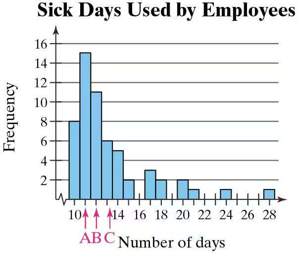
Graphical Analysis In Exercises 59 and 60, the letters A, B, and C are marked on the horizontal axis. Describe the shape of the data. Then determine which is the mean, which is the median, and which is the mode. Justify your answers.
 Verified video answer for a similar problem:
This video solution was recommended by our tutors as helpful for the problem above
Video duration:
3mWas this helpful?
Key Concepts
Here are the essential concepts you must grasp in order to answer the question correctly.
Shape of the Data Distribution
The shape of a data distribution refers to how the data points are spread across the range of values. Common shapes include normal, skewed, and uniform distributions. In this case, the histogram shows a right-skewed distribution, where most data points cluster on the left side, indicating that most employees used fewer sick days.
Recommended video:
Guided course

 04:39
04:39Visualizing Qualitative vs. Quantitative Data
Mean, Median, and Mode
Mean, median, and mode are measures of central tendency that summarize a dataset. The mean is the average of all data points, the median is the middle value when data is ordered, and the mode is the most frequently occurring value. Understanding these concepts is crucial for interpreting the data represented in the histogram.
Recommended video:
Guided course
 04:48
04:48Comparing Mean vs. Median
Interpreting Histograms
Histograms are graphical representations of frequency distributions, where the height of each bar indicates the number of occurrences of data points within specific intervals. Analyzing histograms helps identify patterns, such as peaks and gaps, which can inform conclusions about the data's central tendency and variability.
Recommended video:
Guided course
 05:54
05:54Intro to Histograms

Related Videos
Related Practice

