2. Describing Data with Tables and Graphs
Bar Graphs and Pareto Charts
Problem 2.2.37
Textbook Question
Extending Concepts
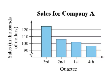
A Misleading Graph? A misleading graph is not drawn appropriately, which can misrepresent data and lead to false conclusions. In Exercises 37–40, (a) explain why the graph is misleading, and (b) redraw the graph so that it is not misleading.
 Verified step by step guidance
1
Step 1: Analyze the graph provided. Notice that the vertical axis (Sales in thousands of dollars) does not start at zero but instead starts at 90. This can exaggerate the differences between the bars and make the changes in sales appear more dramatic than they actually are.
Step 2: Explain why the graph is misleading. By not starting the vertical axis at zero, the graph visually distorts the proportional differences between the sales figures for each quarter. This can lead viewers to believe that the sales differences are larger than they truly are.
Step 3: To redraw the graph so that it is not misleading, start the vertical axis at zero. This ensures that the visual representation of the data accurately reflects the true differences in sales figures.
Step 4: Ensure that the spacing between the bars and the scaling of the vertical axis are consistent. This helps maintain clarity and avoids any visual distortion.
Step 5: Label the axes clearly and use appropriate increments on the vertical axis to represent the sales data accurately. This will make the graph more honest and easier to interpret.
Verified video answer for a similar problem:This video solution was recommended by our tutors as helpful for the problem above
Video duration:
1mWas this helpful?

 4:52m
4:52mWatch next
Master Creating Bar Graphs and Pareto Charts with a bite sized video explanation from Patrick
Start learningRelated Videos
Related Practice