Table of contents
- 1. Intro to Stats and Collecting Data55m
- 2. Describing Data with Tables and Graphs1h 55m
- 3. Describing Data Numerically1h 45m
- 4. Probability2h 16m
- 5. Binomial Distribution & Discrete Random Variables2h 33m
- 6. Normal Distribution and Continuous Random Variables1h 38m
- 7. Sampling Distributions & Confidence Intervals: Mean1h 3m
- 8. Sampling Distributions & Confidence Intervals: Proportion1h 12m
- 9. Hypothesis Testing for One Sample1h 1m
- 10. Hypothesis Testing for Two Samples2h 8m
- 11. Correlation48m
- 12. Regression1h 4m
- 13. Chi-Square Tests & Goodness of Fit1h 20m
- 14. ANOVA1h 0m
1. Intro to Stats and Collecting Data
Intro to Stats
Problem 10.RE.3c
Textbook Question
Time and Motion In a physics experiment at Doane College, a soccer ball was thrown upward from the bed of a moving truck. The table below lists the time (sec) that has lapsed from the throw and the corresponding height (m) of the soccer ball.
[IMAGE]
c. What horrible mistake would be easy to make if the analysis is conducted without a scatterplot?
 Verified step by step guidance
1
Understand the context of the problem: The question is asking about a potential mistake that could occur if the analysis is conducted without using a scatterplot. A scatterplot is a graphical representation of data points, which helps visualize relationships or patterns between variables.
Recognize the role of a scatterplot: A scatterplot is particularly useful in identifying trends, outliers, or non-linear relationships in the data. Without it, one might incorrectly assume a specific type of relationship (e.g., linear) between the variables.
Consider the nature of the data: In this case, the data involves time and height of a soccer ball. The height of the ball is likely to follow a parabolic trajectory due to the effects of gravity, which is a non-linear relationship.
Identify the potential mistake: If the analysis is conducted without a scatterplot, one might mistakenly assume a linear relationship between time and height. This could lead to incorrect conclusions or an inappropriate model being applied to the data.
Conclude the importance of visualization: Emphasize that creating a scatterplot is a critical step in data analysis to ensure that the correct relationship between variables is identified and to avoid making assumptions that could lead to errors in interpretation.
 Verified video answer for a similar problem:
This video solution was recommended by our tutors as helpful for the problem above
Video duration:
3mPlay a video:
Was this helpful?
Key Concepts
Here are the essential concepts you must grasp in order to answer the question correctly.
Scatterplot
A scatterplot is a graphical representation that displays values for typically two variables for a set of data. Each point on the plot corresponds to an observation in the dataset, allowing for visual assessment of relationships, trends, and potential outliers. In the context of the soccer ball experiment, a scatterplot would help visualize how height changes over time, making it easier to identify patterns or anomalies.
Recommended video:
Guided course

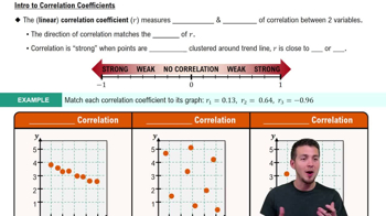
Scatterplots & Intro to Correlation
Correlation
Correlation refers to a statistical measure that describes the extent to which two variables change together. A positive correlation indicates that as one variable increases, the other also tends to increase, while a negative correlation indicates the opposite. Without a scatterplot, one might misinterpret the relationship between time and height, potentially overlooking important trends or suggesting a false correlation.
Recommended video:
Guided course

Correlation Coefficient
Outliers
Outliers are data points that differ significantly from other observations in a dataset. They can skew results and lead to incorrect conclusions if not properly identified and analyzed. In the soccer ball experiment, failing to use a scatterplot could result in overlooking outliers that may indicate measurement errors or unique events, which could mislead the analysis of the ball's motion.
Recommended video:
Guided course

Comparing Mean vs. Median

 2:13m
2:13mWatch next
Master Introduction to Statistics Channel with a bite sized video explanation from Patrick
Start learning


