2. Describing Data with Tables and Graphs
Frequency Distributions
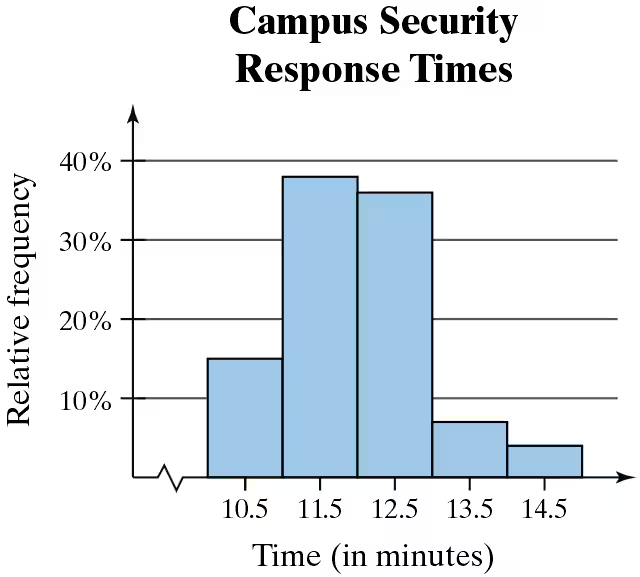
Problem 2.1.24c
Textbook Question
Use the relative frequency histogram to describe any patterns with the data.
 Verified video answer for a similar problem:
This video solution was recommended by our tutors as helpful for the problem above
Video duration:
1mWas this helpful?
Key Concepts
Here are the essential concepts you must grasp in order to answer the question correctly.
Relative Frequency
Relative frequency is the ratio of the frequency of a particular category to the total number of observations. It is expressed as a percentage and helps in understanding the proportion of data points that fall within specific intervals. In the context of the histogram, it indicates how often response times occur relative to the total response times recorded.
Recommended video:
Guided course

 06:38
06:38Intro to Frequency Distributions
Histogram
A histogram is a graphical representation of the distribution of numerical data, where the data is divided into intervals (bins) and the frequency of data points within each interval is represented by the height of bars. In this case, the histogram displays campus security response times, allowing for visual analysis of patterns such as central tendency and variability in response times.
Recommended video:
Guided course
 05:54
05:54Intro to Histograms
Patterns in Data
Identifying patterns in data involves analyzing the distribution and trends within the dataset. In the histogram, patterns may include peaks (modes), gaps, or trends that indicate how response times are clustered. For instance, a higher relative frequency in certain time intervals suggests that those response times are more common, which can inform operational decisions for campus security.
Recommended video:
Guided course
 04:39
04:39Visualizing Qualitative vs. Quantitative Data
 6:38m
6:38mWatch next
Master Intro to Frequency Distributions with a bite sized video explanation from Patrick
Start learningRelated Videos
Related Practice


