2. Describing Data with Tables and Graphs
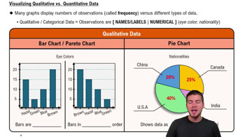
Visualizing Qualitative vs. Quantitative Data
Struggling with Statistics for Business?
Join thousands of students who trust us to help them ace their exams!Watch the first videoMultiple Choice
Which of the following is NOT a valid sparkline type in data visualization?
A
Column
B
Bar
C
Line
D
Win/Loss
 Verified step by step guidance
1
Understand the concept of sparklines: Sparklines are small, simple charts embedded in text or tables to provide a quick visual representation of data trends. Common types include Line, Column, and Win/Loss.
Review the provided options: Column, Bar, Line, and Win/Loss. Compare each option to the standard sparkline types used in data visualization.
Recall that Bar charts are not typically considered a valid sparkline type. Sparklines are designed to be compact and minimalistic, whereas Bar charts are larger and more detailed.
Confirm that Column, Line, and Win/Loss are valid sparkline types. These are commonly used in tools like Excel for quick data visualization.
Conclude that the correct answer is 'Bar,' as it is not a valid sparkline type in data visualization.

 4:39m
4:39mWatch next
Master Visualizing Qualitative vs. Quantitative Data with a bite sized video explanation from Patrick
Start learningRelated Videos
Related Practice