3. Describing Data Numerically
Standard Deviation
Problem 2.4.9
Textbook Question
Using and Interpreting Concepts
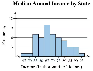
Finding the Range of a Data Set In Exercises 9 and 10, find the range of the data set represented by the graph.
 Verified step by step guidance
1
Step 1: Understand the concept of range. The range of a data set is the difference between the maximum and minimum values in the data set.
Step 2: Identify the minimum value from the graph. Look at the lowest income value represented on the x-axis, which is 45 (in thousands of dollars).
Step 3: Identify the maximum value from the graph. Look at the highest income value represented on the x-axis, which is 95 (in thousands of dollars).
Step 4: Calculate the range by subtracting the minimum value from the maximum value. Use the formula: Range = Maximum - Minimum.
Step 5: Interpret the result. The range represents the spread of the data set, showing the difference between the highest and lowest median annual incomes by state.
Verified video answer for a similar problem:This video solution was recommended by our tutors as helpful for the problem above
Video duration:
2mWas this helpful?
Key Concepts
Here are the essential concepts you must grasp in order to answer the question correctly.
Range
The range of a data set is a measure of dispersion that indicates the difference between the maximum and minimum values. It provides a simple way to understand the spread of the data. To calculate the range, subtract the smallest value from the largest value in the data set. In the context of the provided graph, identifying the highest and lowest income values will allow for the calculation of the range.
Recommended video:
Guided course

 05:45
05:45Find 5-Number Summary - TI-84 Calculator Example 1
Histogram
A histogram is a graphical representation of the distribution of numerical data, where the data is divided into intervals (bins) and the frequency of data points within each interval is represented by the height of bars. In the given graph, the x-axis represents income ranges, while the y-axis shows the frequency of states within those income ranges. Understanding histograms is essential for interpreting data distributions and identifying patterns.
Recommended video:
Guided course
 05:54
05:54Intro to Histograms
Frequency Distribution
Frequency distribution is a summary of how often each value occurs in a data set. It can be represented in various forms, including tables and graphs like histograms. In the context of the graph, the frequency distribution shows how many states fall within specific income ranges, allowing for insights into income distribution across states. This concept is crucial for analyzing data trends and making comparisons.
Recommended video:
Guided course
 06:38
06:38Intro to Frequency Distributions
 8:45m
8:45mWatch next
Master Calculating Standard Deviation with a bite sized video explanation from Patrick
Start learningRelated Videos
Related Practice

